B2B and Enterprise Projects for Renault
Even though initially I was hired to to create Renault Port at Renault, I got to help them out with some internal projects as well, resulting in increased efficiency and revenue.
Finding Nemo1
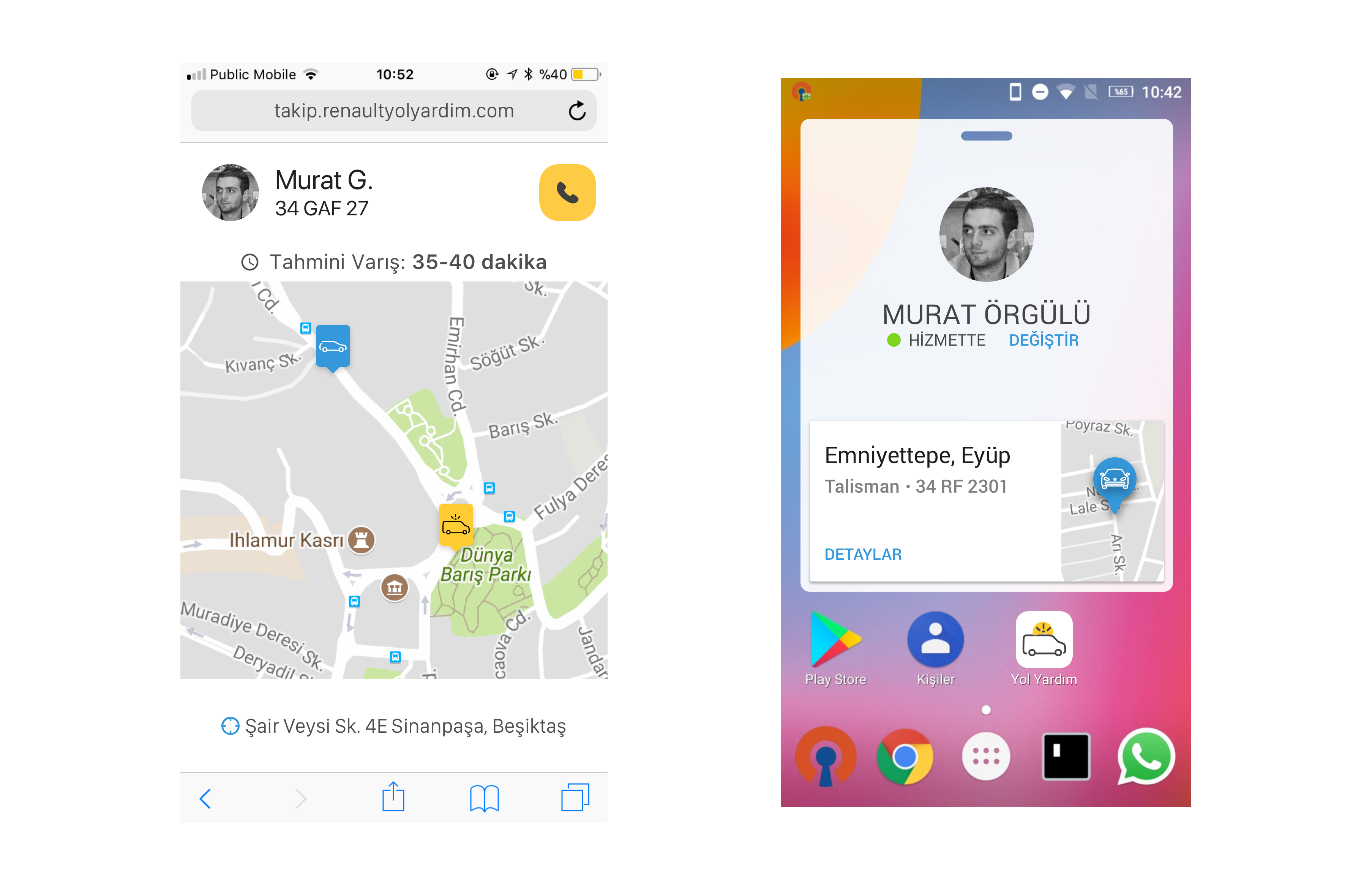
Renault has a complimentary roadside assistance service for cars in warranty, which is provided by authorized repair centers. The specifics of the service results in multiple calls, might cause long wait times for drivers in distress, and offers very little feedback for the status of the process.
After some research, we created the new call center app, including the “wayfinding” technology for the distressed users and roadside assistance providers. It pinpoints a users location and returns it to the call center, which is pushed to the roadside mechanics device. The user can also track where the mechanic is on the map.

The Research
For users, we benchmarked a few apps that people use daily and are familiar with, like Uber and BiTaksi. The expectations of people were quite clear when it came to that interaction.
The call center workers and the mechanics required some more effort. I did some ethnographic research on how they worked, and interviewed a few key people to create the most efficient and effective app possible.
Outcome
I ended up creating wireframes and flows for a mobile web app for drivers, an Android app for mechanics, and a web app for the call center. I also created UI elements for the Android and mobile web apps, based on Renault’s styleguides.

The project has become the first software to be commercialized by Renault MAİS as a SaaS product, which is sold to other companies in need of a call-center platform.
Responsive Responses
Renault dealerships need to get permissions from their regional managers to apply discounts to the cars sold. The dealers were complaining of late replies that lost them sales, and the corporate managers were struggling to find a remedy.
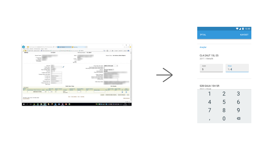
I interviewed a few regional managers -the users of the app- to find the root cause: Turns out it was mobility. They were always on the move, from one dealership to the other. The screens used to approve discounts were regular Oracle database screens that required a full desktop experience to work correctly. Therefore, they only had the time to review requests during the evenings and weekends.
With a consequent research, I figured out the most necessary information they needed to review the discount requests, and created a light-weight Material Design based web form that allowed the managers to approve discounts on the move.

Outcome
This new little screen improved approval times immensely, resulting in happier dealers and increased sales. The company has also started auditing its other tools for different use cases that might benefit from the same usability-first design approach.
- The project was unnamed, so I also got to decide on the codename, thus the Pixar reference. :) [return]